
What Countertops Go With Maple Cabinets?
Maple cabinets are often misunderstood.
Too often, they’re paired by default—either with stark white surfaces that feel disconnected, or with warm tones that push the kitchen toward yellow. The result is rarely intentional.
But when handled correctly, maple becomes one of the most versatile and refined cabinet choices available.
The key is not contrast.
The key is pairing.
Understanding Maple First (Before Choosing a Countertop)
Before selecting a countertop, it’s important to understand what maple is doing in the room.
Maple is:
warm, but not deeply saturated
fine-grained, without heavy movement
neutral-leaning, but sensitive to undertones
This last point matters most.
Maple will amplify whatever it sits next to.
Pair it with the wrong surface, and it turns yellow.
Pair it well, and it reads as soft, natural, and architectural.
The Goal: Balance, Not Match
The best countertops for maple cabinets do one of three things:
Calm the warmth
Introduce quiet contrast
Add subtle movement without competition
What you want to avoid is anything that:
competes with the grain
exaggerates undertones
or feels overly decorative
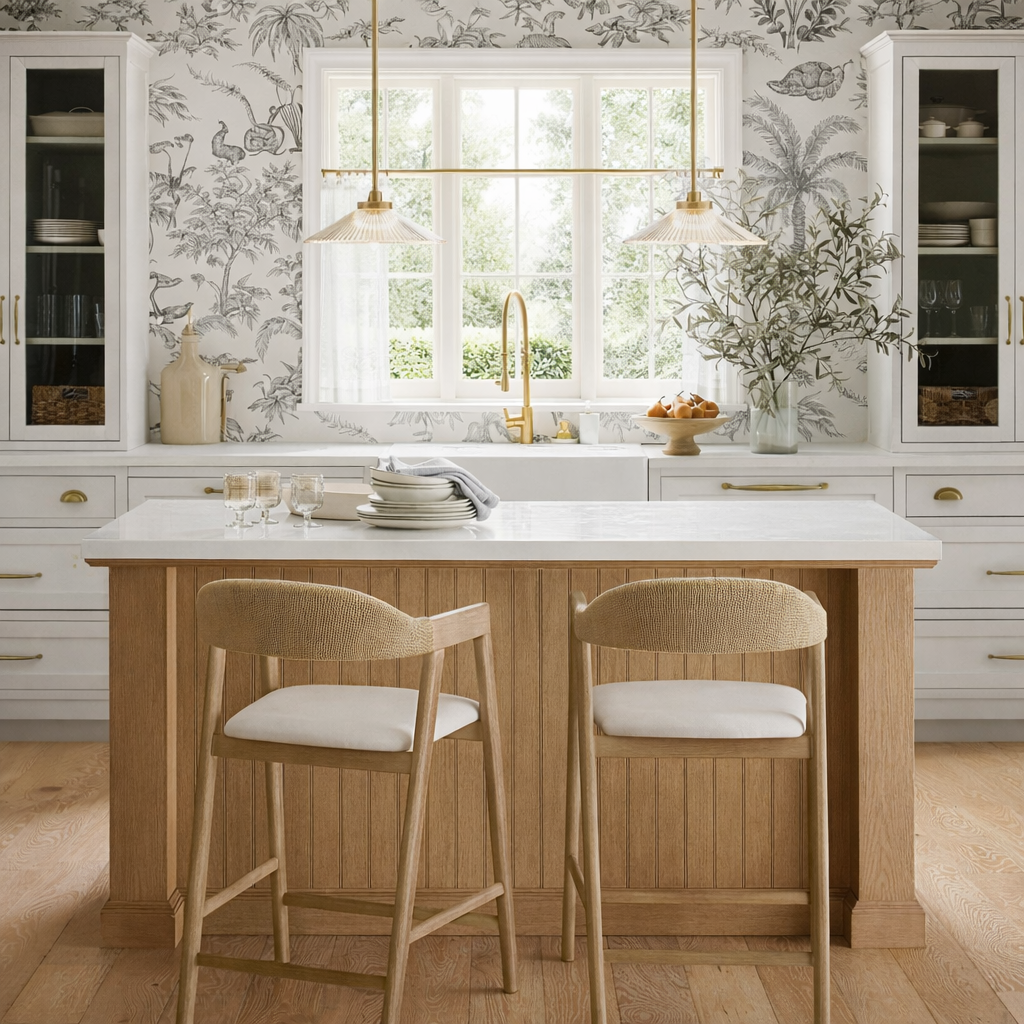
1. Soft White Quartz (The Most Reliable Pairing)
This is the most consistent and forgiving option.
A soft white quartz with fine, low-contrast veining creates a clean surface that allows the cabinetry to remain the anchor.
Why it works:
Keeps the palette light without becoming stark
Introduces movement without visual noise
Balances warmth with restraint
What to look for:
Slightly warm or neutral white base (not icy)
Fine, organic veining (not bold or linear)
Matte or soft-polish finish
What to avoid:
Bright, blue-white surfaces
Heavy, dramatic veining
High gloss
This pairing is especially effective in kitchens where you want:
clarity
openness
and long-term flexibility
2. Matte Black or Soft Charcoal (For Structure and Depth)
For a more defined, architectural look, darker countertops can work beautifully with maple.
A matte black or softened charcoal surface introduces contrast without harshness.
Why it works:
Grounds the cabinetry
Adds visual weight
Creates a clear horizontal line
The key is the finish:
Glossy black becomes modern and reflective.
Matte black feels quiet, tailored, and intentional.
Pair with:
black or dark hardware
warm lighting
lighter walls or backsplash
This combination suits kitchens where you want:
definition
contrast
and a slightly more tailored feel
3. Warm Marble-Look Quartz (Used Carefully)
A marble-look surface can work—but only if it is restrained.
The right version has:
soft, feathered veining
a warm or neutral base
low contrast overall
Why it works:
Adds natural movement
Introduces a classic material language
Softens the cabinetry without overpowering it
Where it goes wrong:
Many marble-look surfaces are too bold.
Heavy veining:
competes with the cabinet grain
creates visual clutter
and pulls the kitchen toward trend rather than permanence
This pairing works best when everything else is simplified:
minimal hardware
restrained backsplash
quiet palette
4. Tonal Stone (For a More Layered, Subtle Look)
Instead of contrast, some kitchens benefit from tonal layering.
A countertop in a soft taupe, warm gray, or muted stone tone can sit close to the cabinetry without blending into it.
Why it works:
Creates continuity across surfaces
Feels calm and cohesive
Avoids sharp transitions
This is a more understated approach, often seen in:
European kitchens
design-led interiors
spaces where texture matters more than contrast
The Backsplash Matters More Than You Think
The countertop does not exist in isolation.
What sits above it will either:
support the pairing
or disrupt it
With maple cabinets, the most successful backsplashes are:
handmade-style tiles with subtle variation
neutral tones that don’t compete
low sheen finishes that reflect light softly
Avoid:
high-contrast patterns
overly busy layouts
stark white tiles against warm cabinetry
The Floor: The Silent Influence
Flooring plays a quiet but critical role in how your countertop reads.
With maple cabinets, the floor should:
sit in a neutral range
avoid strong red or orange undertones
not lean too cool or gray
A floor that is too warm will push the entire kitchen toward yellow.
A floor that is too cool will flatten the warmth of the cabinetry.
The right floor allows both cabinet and countertop to sit comfortably without tension.
Paint Color: Avoiding Undertone Conflict
Wall color will either resolve the palette or destabilize it.
With maple cabinets and any of the countertop pairings above, avoid:
cool, blue-based whites
strong yellow creams
Instead, use:
soft, chalky neutrals
tones with subtle warmth
colors that sit quietly alongside wood and stone
This ensures the countertop reads as intended—not skewed by surrounding color.
Combinations That Consistently Work
If you want a clear starting point, these pairings are reliable:
Light & Balanced
Maple cabinets
Soft white quartz
Neutral tile backsplash
Warm, light wood floor
Grounded & Structured
Maple cabinets
Matte black countertop
Handmade-style tile
Warm neutral walls
Soft & Layered
Maple cabinets
Warm marble-look quartz
Fine-scale wallpaper or subtle tile
Muted, natural flooring
Final Thought
Choosing a countertop for maple cabinets is not about finding a match.
It’s about creating balance.
When done well:
the cabinetry anchors
the countertop clarifies
and the surrounding materials bring everything into alignment
Nothing competes. Nothing feels accidental.
The result is not a trend-driven kitchen—but one that feels considered, calm, and complete.
Explore complete kitchen compositions built around these pairings →