
Elegant Black Kitchen Cabinets Done Right
The Hinwick Estates Kitchen
A resolute black kitchen that anchors the room with quiet strength, relying on proportion, finish, and light rather than decoration.
A More Considered Approach to Black Cabinetry
Black cabinetry has long been part of traditional interiors—used not for contrast, but for structure.
In the Hinwick Estates Kitchen, black is not treated as a statement. It is treated as a foundation. The cabinetry defines the room in the same way a dark beam or aged timber floor might: quietly, with intention, and without excess.
What allows it to work is not the color alone, but the way it is paired—with materials, with light, and with restraint.
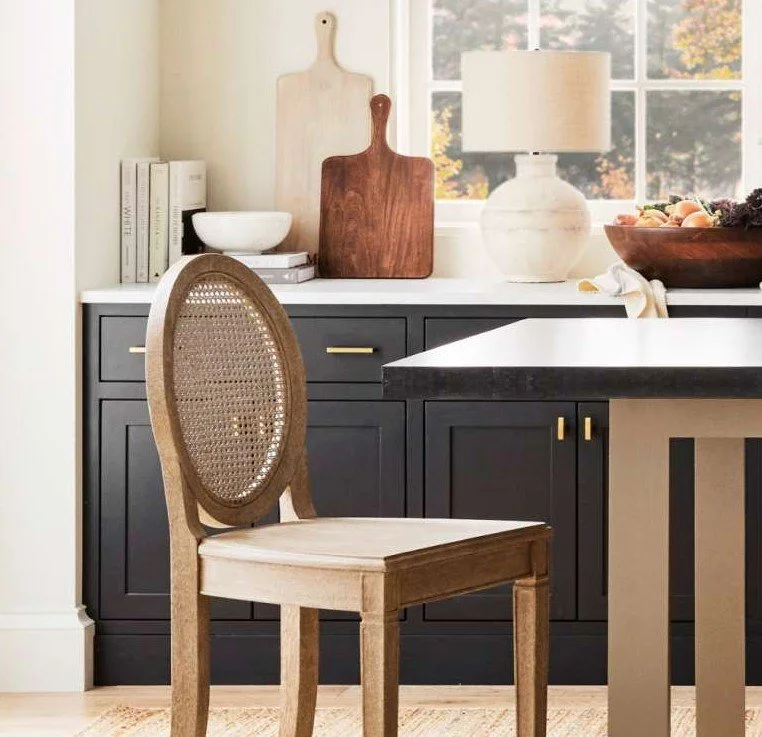
The Cabinetry: Depth Without Harshness
The cabinetry is finished in a soft matte black, avoiding any gloss or sharp reflection.
This is essential.
A high-gloss black introduces movement and glare, which quickly becomes modern and visually active. A matte finish, by contrast:
absorbs light
softens edges
allows the cabinetry to feel settled and architectural
The shaker profile reinforces this. Its simplicity gives the color space to breathe, ensuring the cabinetry feels enduring rather than styled.
Hardware: Defining the Structure
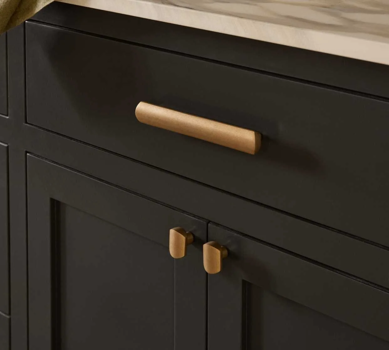
The use of warm brass hardware introduces a measured contrast.
It is not decorative—it is structural.
The slim pulls:
punctuate the cabinetry
create rhythm across the elevation
and introduce warmth without distraction
Against the black, the brass reads as a quiet highlight rather than a focal point.
The Countertop and Tile: Controlling Contrast
Above the cabinetry, the palette begins to lift.
A soft white surface with gentle veining provides a necessary counterpoint. The veining is restrained—fine, organic, and slightly blurred—so that it reads as natural rather than graphic.
This is important.
Strong, high-contrast veining would compete with the cabinetry. Here, the surface remains calm, allowing the eye to rest.
The backsplash, in a handmade-style neutral tile, introduces:
subtle variation
a low sheen that reflects light
and a sense of craftsmanship
Extending the tile horizontally across the full width of the counter creates continuity, while stopping below the wallpaper maintains balance.
The Wallpaper: Pattern as Atmosphere
Above the tile, the wall is finished in a fine-scale botanical wallpaper in bronze and soft black.
The scale is intentionally reduced.
Large-scale patterns can quickly dominate a kitchen, particularly when paired with dark cabinetry. A smaller, more intricate pattern instead creates:
texture at a distance
detail upon closer inspection
The bronze undertone connects gently to the warmth of the hardware and wood elements, ensuring the palette remains cohesive.
The Floor: The Quiet Foundation
The flooring is one of the most important—and often overlooked—decisions in a black kitchen.
Here, a neutral hardwood floor in a light, natural tone plays a critical role.
It must not:
skew orange
lean gray
or introduce strong red undertones
Instead, it should sit quietly between warm and cool, allowing the cabinetry and wallpaper to remain the focus.
A floor that is too warm will clash with the black and brass, pulling the room toward yellow.
A floor that is too cool will flatten the space, making the cabinetry feel stark.
The right floor acts as a bridge:
grounding the cabinetry
softening the contrast
and bringing a sense of ease to the room
Paint Color: Controlling Undertones
Where painted walls are introduced—adjacent rooms, ceilings, or trim—the color must be handled with care.
Black cabinetry amplifies undertones.
Cool whites can feel stark and clinical.
Yellow-based creams can feel heavy and dated.
Instead, the palette benefits from:
soft, chalky neutrals
subtle warmth without obvious color
tones that sit quietly alongside both black and bronze
Colors such as Mouse’s Back, Drop Cloth or Jitney work particularly well, offering:
balance
softness
and continuity across spaces
The goal is not contrast, but cohesion.
Light: The Unifying Element
Natural light is what ultimately allows the composition to settle.
As it moves through the space:
the matte cabinetry deepens and softens
the tile reflects a gentle glow
the wallpaper reveals its detail
This variation prevents the palette from feeling static.
Artificial lighting should follow the same principle—warm, diffused, and directional rather than bright or cool.
Where This Kitchen Belongs
The Hinwick Estates Kitchen is not tied to a single architectural style, but it does suit certain homes particularly well:
Georgian and Georgian-inspired homes
where symmetry and proportion already existEnglish country or estate-style interiors
where material layering and restraint are valuedTransitional homes
where traditional forms meet modern simplicity
It is less suited to:
highly contemporary, minimal spaces
or interiors driven by bold color and contrast
A Kitchen Designed for Living
Beyond aesthetics, this kitchen supports a particular way of living.
It suits:
slower, considered routines
spaces that are used throughout the day
kitchens that are both functional and quietly social
The materials are durable, but more importantly, they are forgiving:
matte finishes hide wear
natural textures age well
and nothing feels overly precious
The Overall Effect
The Hinwick Estates Kitchen is composed through restraint.
Black cabinetry provides structure
Light surfaces introduce clarity
Texture adds depth
Warm materials create balance
Nothing is excessive. Nothing is missing.
The result is a kitchen that feels:
grounded
calm
and enduring
Final Thought
A black kitchen does not rely on contrast or trend to succeed.
It relies on pairing.
When each element is chosen with care—floor, finish, light, and tone—the result is not dramatic, but lasting.
Explore more kitchen Editions built on this same philosophy →