
What Colors Make a Kitchen Look Expensive?
The perception of luxury in a kitchen is rarely dictated by cost alone. It is established through restraint, balance, and an understanding of what endures. Color, more than any single element, sets this foundation. When chosen well, it elevates even the simplest cabinetry into something architectural and composed. When chosen poorly, it diminishes proportion, material, and light in equal measure.
The kitchens that feel truly expensive do not rely on novelty. They rely on colors that have proven their permanence—tones that sit quietly within a space rather than calling attention to themselves.
The Case for Timeless Over Trend
Timeless color is not simply about neutrality; it is about longevity.
A kitchen designed around fleeting shades will inevitably date itself, no matter how refined the craftsmanship. In contrast, a palette grounded in classic tones allows the design to mature gracefully. These colors do not compete with architecture or materials. They support them.
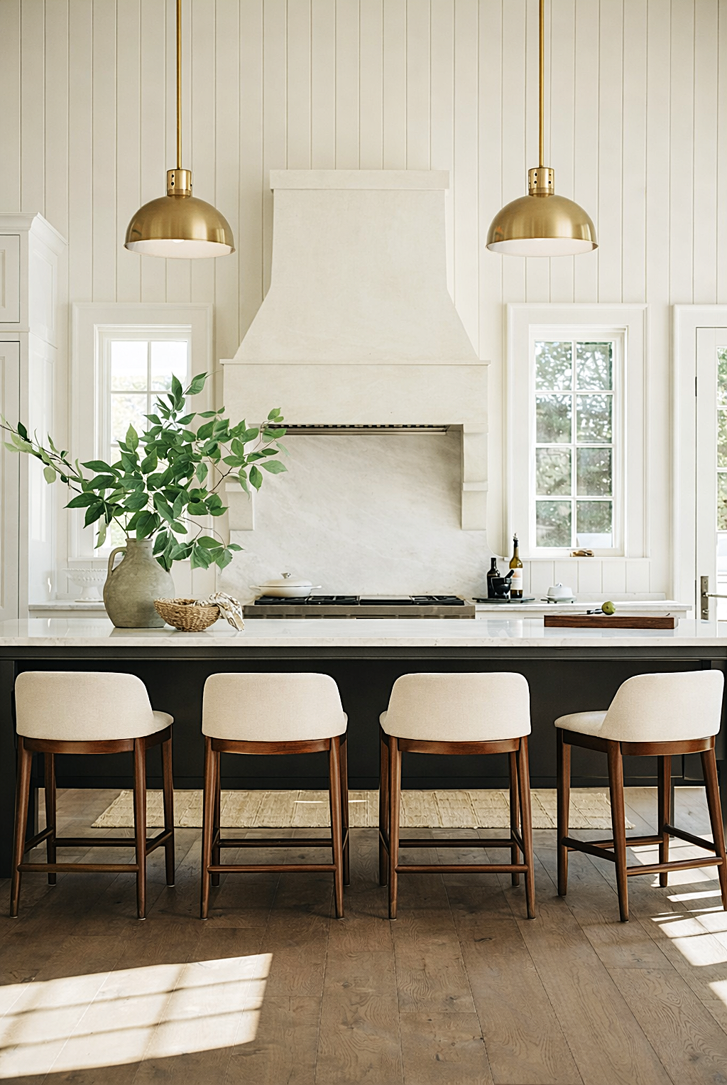
Soft whites, warm neutrals, deep charcoals, and considered blacks have remained relevant not because they are safe, but because they are inherently balanced. They respond well to changing light, they complement natural materials, and they provide a consistent backdrop for daily life.
An expensive kitchen does not announce the year it was created. It feels as though it has always belonged.
The Strength of Classic Neutrals
Neutral does not mean plain. It means disciplined.
Warm off-whites and layered creams bring softness without sterility. They avoid the harshness of bright white, instead offering a subtle depth that shifts throughout the day. These tones work particularly well in smaller or light-filled spaces, where they reflect light gently rather than sharply.
Greige and stone hues introduce a quiet complexity. Sitting between warm and cool, they provide flexibility, allowing metals, woods, and surfaces to coexist without tension. They are especially effective in kitchens that bridge traditional and contemporary elements.
Taupe, often overlooked, carries a richness that reads as considered rather than decorative. It adds warmth without heaviness and pairs effortlessly with natural stone and aged metals.
These are not colors that demand attention. They reward it.
Deep Tones and the Language of Richness
While lighter palettes create openness, deeper tones establish presence.
Charcoal, in particular, offers a refined alternative to black. It softens contrast while maintaining depth, allowing cabinetry to feel substantial without becoming overpowering. It is a color that responds beautifully to both natural and artificial light, revealing subtle undertones rather than flattening into darkness.
Black, when handled correctly, remains one of the most powerful choices in kitchen design. A nuanced black—slightly softened, never stark—creates a sense of permanence and authority. It anchors a space, especially when balanced with lighter worktops, warm metals, and reflective surfaces.
Deep greens and muted navy tones can also read as rich and classic when desaturated and used with restraint. They should feel grounded rather than vibrant, acting as an extension of the natural palette rather than a departure from it.
Richness, in this context, is not about boldness. It is about depth.
The Role of Undertones
An expensive-looking kitchen is cohesive, and cohesion begins with undertones.
Every color carries a subtle bias—warm, cool, or neutral. When these undertones align across cabinetry, walls, and finishes, the space feels intentional. When they clash, even the most beautiful materials can feel disjointed.
Warm neutrals pair naturally with aged brass, unlacquered finishes, and timber. Cooler tones align with polished nickel, marble, and more contemporary detailing. The key is consistency, not uniformity.
This level of consideration is often invisible to the eye, yet it defines the overall impression of the space.
Material and Color Are Inseparable
Color alone does not create luxury. It is the interaction between color and material that defines it.
A painted cabinet in a soft neutral takes on a completely different character when paired with honed marble versus polished quartz. A deep charcoal becomes richer when set against natural veining, and a warm white gains depth when contrasted with patinated metal.
This is why expensive kitchens feel layered rather than flat. The color is never isolated; it is always in dialogue with texture, finish, and light.
Restraint as a Design Principle
Perhaps the most defining characteristic of an expensive kitchen palette is restraint.
Limiting the number of colors allows each one to be fully realized. It creates clarity, which in turn enhances the perception of space and quality. Repetition of tones across cabinetry, walls, and details reinforces this sense of cohesion.
There is confidence in holding back. In allowing a single tone to carry through an entire elevation. In resisting the urge to introduce contrast for its own sake.
This is where true luxury resides—not in excess, but in control.
A Palette That Endures
Ultimately, the colors that make a kitchen look expensive are those that outlast preference.
They are classic without feeling traditional, neutral without feeling empty, and rich without feeling heavy. They support the architecture, elevate the materials, and respond gracefully to light.
They do not seek attention, yet they hold it.
And that is what defines a kitchen of lasting value.